The guide to risograph prints
Three pieces out of Issue 01: the process, the technique and the mistake. Read them in order, or jump to the one you came for.
What is a risograph print?
A stencil, a drum, one ink at a time. The machine was built for church newsletters, and it makes the best-looking mistakes in printing.
A photocopier that thinks it is a press
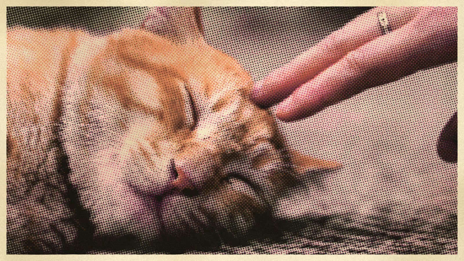
The Risograph is a digital duplicator, made by the Riso Kagaku Corporation in Japan and sold since the mid-1980s as a cheap way to run off a few hundred copies of something. It scans a page and burns the image, as a pattern of tiny holes, into a sheet of master film. The master is wrapped around a drum. Ink inside the drum is pushed out through the holes as the paper passes underneath. That is the whole trick: a stencil press, a mimeograph with a scanner on top, and it prints one colour at a time, because a drum holds one ink.
To print a second colour you swap the drum and run the same stack of paper through again. A third colour is a third pass. Every pass is a fresh chance for the paper to land a hair to the left of where it landed last time, and paper takes every chance it is given. Nothing about the machine was designed to make art. Schools, churches and union halls bought it for newsletters. Artists found it in the 2000s, when the newsletters had moved online and the machines were cheap.
Why the prints look like that
The inks are translucent, oily and few. Riso ink is soy-based and never fully dries into the paper the way an inkjet does; it sits on top, smudges a little, and where two inks overlap they mix, so blue over yellow gives a real green. The standard range runs to several dozen colours, and the famous ones are the ones no other process has, fluorescent pink and fluorescent orange first among them. A risograph palette is two or three of these. Nobody mixes a thousand on the fly.
The master is a stencil, so a spot on the page either has ink or it does not. There is no lighter ink. A grey sky has to be broken into dots, large where it is dark and small where it is light, and the eye is left to mix them back. That is a halftone, and it is a technique the risograph borrows rather than owns; how the dots work is its own piece. What the riso adds is coarseness: the master is not fine, the ink spreads, and the dots come out soft and visible.
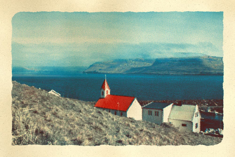
The passes do not line up. A registration error of a millimetre is normal, and a print shop that fought it would lose. So the colours sit slightly apart, a ghost of pink beside every edge that should have been one line. Every studio that prints this way prints misregistration on purpose, or at least on acceptance.
What it is not
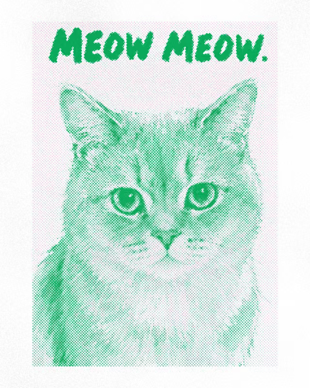
A risograph is not a screen print, though the two are cousins. Screen printing pushes ink through a mesh stencil by hand, one screen per colour; the ink is thicker, the dots coarser still, and the registration is the printer's own arm. It is not offset lithography, which is what a magazine is printed on, with four inks at fine screens and registration measured in hundredths of a millimetre. And it is not a filter. A filter is applied to a picture. A risograph re-draws the picture from nothing, one ink at a time, and the result is a different object from the photograph that went in.
The same press, in a browser
RETROPRINT does what the machine does, in the order it does it. A photo is separated into two to seven ink plates, from a palette of real riso inks. Each plate is screened into dots at a frequency and angle you set. The plates are laid back down one over another, out of register by a margin you choose, with the ink mixing where they overlap. Then the paper: procedural stock with fibres and speckle, no two sheets alike. The export is rendered again at full size on the server, so the print you download is the one you saw and not a screenshot of it.
Every print in the issue on the front page was made this way, from one photograph and one preset. The pattern book has thirty-four more, each with the design that printed it, ready to paste onto a photo of your own.
How halftone dots work
Ink is on or off. A photograph is neither. The dot is the treaty between them, and it has been signed the same way since the 1880s.
The problem the dot solves
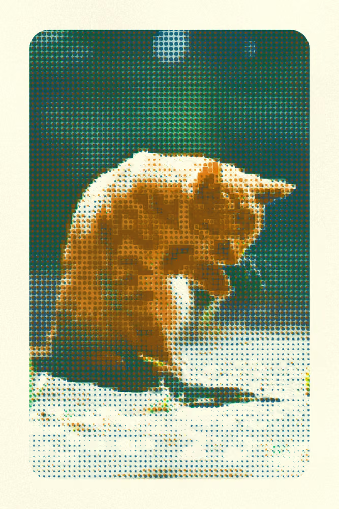
A press has one ink on one plate, and at any point on the paper that ink is either there or not there. A photograph is made of every shade in between. Something has to translate, and since the 1880s that something has been the halftone screen: break the picture into a grid of dots, make each dot as large as the tone under it is dark, and print the dots at a size where the eye gives up and blends them back into grey. Look closely at any newspaper photograph and you see the dots. Step back and you see a face.
The idea is older than photography. Engravers had faked tone with cut lines and stipple for centuries; the screen just did it mechanically, first with a sheet of ruled glass held in front of the plate, later in software, one pixel at a time.
Frequency: lpi
The grid has a pitch, measured in lines per inch, lpi. Newsprint runs around 85; a glossy magazine 150 to 200; a fine art book higher still. The number is a trade. More lines per inch means smaller dots and smoother tone, but the smallest dots vanish and the largest fill in, so the print loses both its ends. Fewer lines per inch means every dot is visible, which is either a fault or the whole point. Most of the prints in the issue on the front page sit between 100 and 250 lpi, and the coarsest, the skateboarder on the cover, is screened at forty to sixty, where the dots stop being a rendering and start being a texture.
Angle, and the rosette
Print two screens at the same angle and they interfere: a coarse pattern rolls across the picture, a moiré, that neither plate has on its own. The fix is to rotate the screens against each other. Four-colour printing settled on 15, 75, 0 and 45 degrees, with black at 45 because the eye is worst at seeing a diagonal grid. Where the rotated screens overlap they make a small flower, the rosette, which is the fingerprint of every commercially printed colour picture of the last century. A risograph print with two or three inks does the same with fewer plates, and in RETROPRINT each plate takes its own angle.
Shape, and the fifty percent dot
A dot is not always round. Round dots close up abruptly in the shadows; elliptical dots join along one axis first and then the other, which smooths the step; square dots give a hard, technical grain; and a line screen is not a dot at all but a set of ruled lines that thicken and thin. All of them meet the same wall at fifty percent. At that tint a round or square dot touches its four neighbours and the screen turns into a checkerboard, ink and paper in equal parts. Below it the paper is the ground and the ink sits on it; above it the roles reverse, and the picture is white holes in a dark field. Every screened print is a negotiation across that line. The shadows on the pier in the issue's feature push past seventy and close up into solid ink, exactly as they should.
The other kind: FM
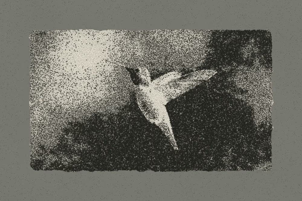
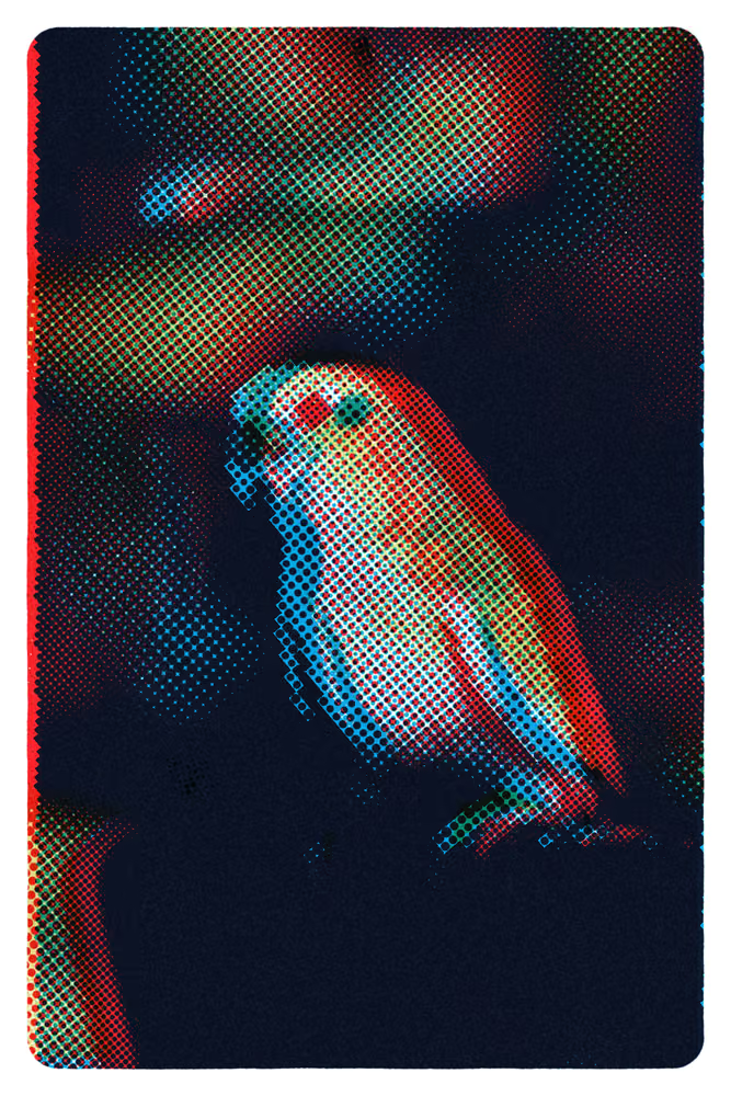
There is a second way to screen. Instead of dots that grow and shrink on a fixed grid, an FM or stochastic screen scatters dots of one small size, more of them where the tone is dark and fewer where it is light. No grid means no angle, no moiré and no rosette; what you get instead is grain, like a fast film. The hummingbird in the issue is one ink of it. RETROPRINT offers both, and a jitter control between them that shakes the grid loose so the dots stop lining up quite so perfectly.
Screening a photo yourself
In the studio each ink plate is screened on its own: a frequency, an angle, a dot shape, and how much jitter. Change the frequency and the dots move under your pointer, because this pass runs in your browser; the export screens the picture again at full resolution on the server, so the download has the dots the screen only approximated. A halftone is one technique the risograph uses, and the reason its plates are so forgiving of a slipped registration is that a picture made of dots already has nowhere it needs to be exactly.
Why misregistration looks good
The pink plate slipped a millimetre. We kept it. This is the whole argument for why.
What it is
A colour print is several prints on the same sheet. Each ink is its own plate and its own pass, and the sheet must come back to exactly the place it was for the second pass to land on the first. Registration is the name for that landing, and misregistration is when it misses. It always misses by something. The question is only by how much, and whether anyone can see it.
The causes are dull and physical. Paper is fed by rollers, and rollers slip. Paper is a mat of fibres that swells when the first pass wets it and shrinks as it dries, so the sheet the second colour meets is not quite the sheet the first colour met. A drum is changed between passes and seats a fraction differently. The stack settles. On a risograph, which was never built to fight any of this, a millimetre either way is a normal day.
What it looks like
An edge that should have been one line becomes two. Where the plates were meant to overlap and now do not, the paper shows through in a thin white sliver. Where one plate has moved out from under another, a band of that ink appears alone: a ghost of pink along the outside of a shape, a halo of yellow where a cat's ear should have ended. Small type doubles, and a face gets a coloured shadow down one side. If the shift is large, the picture separates into its component drawings and you can see, for the first time, what each ink was doing.
Why commercial printing hates it
On an offset press printing a catalogue this is a defect, with a tolerance measured in hundredths of a millimetre, and a whole vocabulary exists to hide it. Trapping spreads one colour slightly under its neighbour so a small shift leaves no white gap. A rich black puts cyan under the black so its edge stays dark if it moves. Registration marks, the little crosshairs in the margins of every proof, exist so an operator can measure the miss and correct it. None of this is wrong. A photograph in a magazine should look like the photograph.
Why riso printing keeps it
A risograph print was never going to look like the photograph. Its two or three inks have already redrawn the picture, its dots are already visible, and the shift is one more honest fact about how the object was made. Kept small, it shows the plates: a print that is perfectly registered looks like a picture, one that is slightly off looks like a print, and that difference is the reason to make one. It adds colour, too. The sliver where pink escapes from under black is the most saturated pink on the page, and nobody put it there. And it puts a hand in the picture. A machine that never misses is a photocopier. A print that misses a little was made by a process with moving parts, and the eye reads that as care rather than error, the way it reads a brushstroke.
There is a limit. A shift that is too large stops reading as a print and starts reading as a printing error; the type goes unreadable and the picture falls apart. The sweet spot is a shift you notice second, not first. Most of the prints in the issue sit there.
Setting it on purpose
RETROPRINT does not pretend the press is perfect. Every plate is offset from the others by a small random amount, and that amount is decided by a seed. Change the seed and every plate slides somewhere else. The margin is yours: the most a plate may move, and zero is an allowed value. Nobody chooses zero. The halftone underneath is what makes this forgiving; a picture already made of dots has no hard edge for the shift to break, only a softer one. It is the third of the four passes the press makes, and the only one whose job is to be slightly wrong.